Painting St Sophrony and the Difficulties of Painting Contemporary Saints
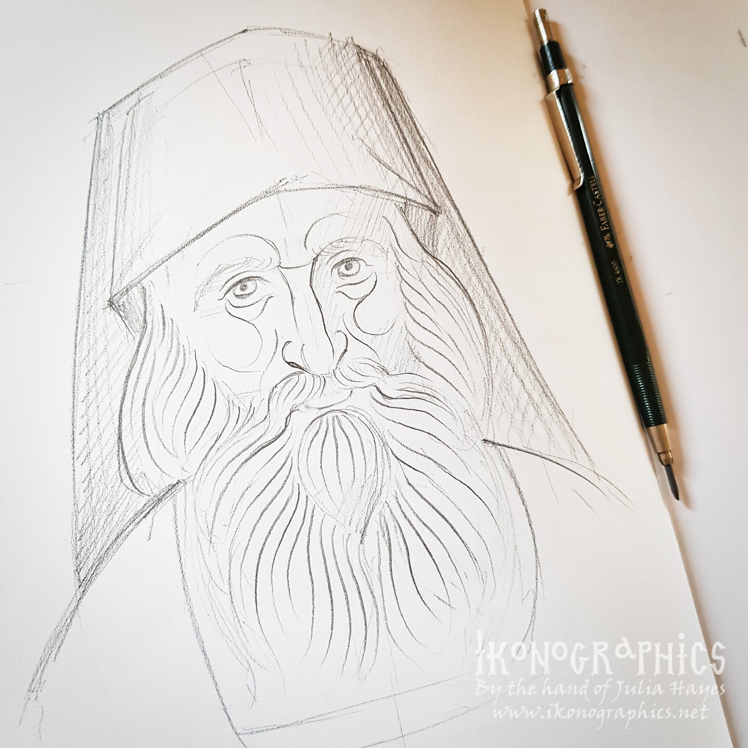
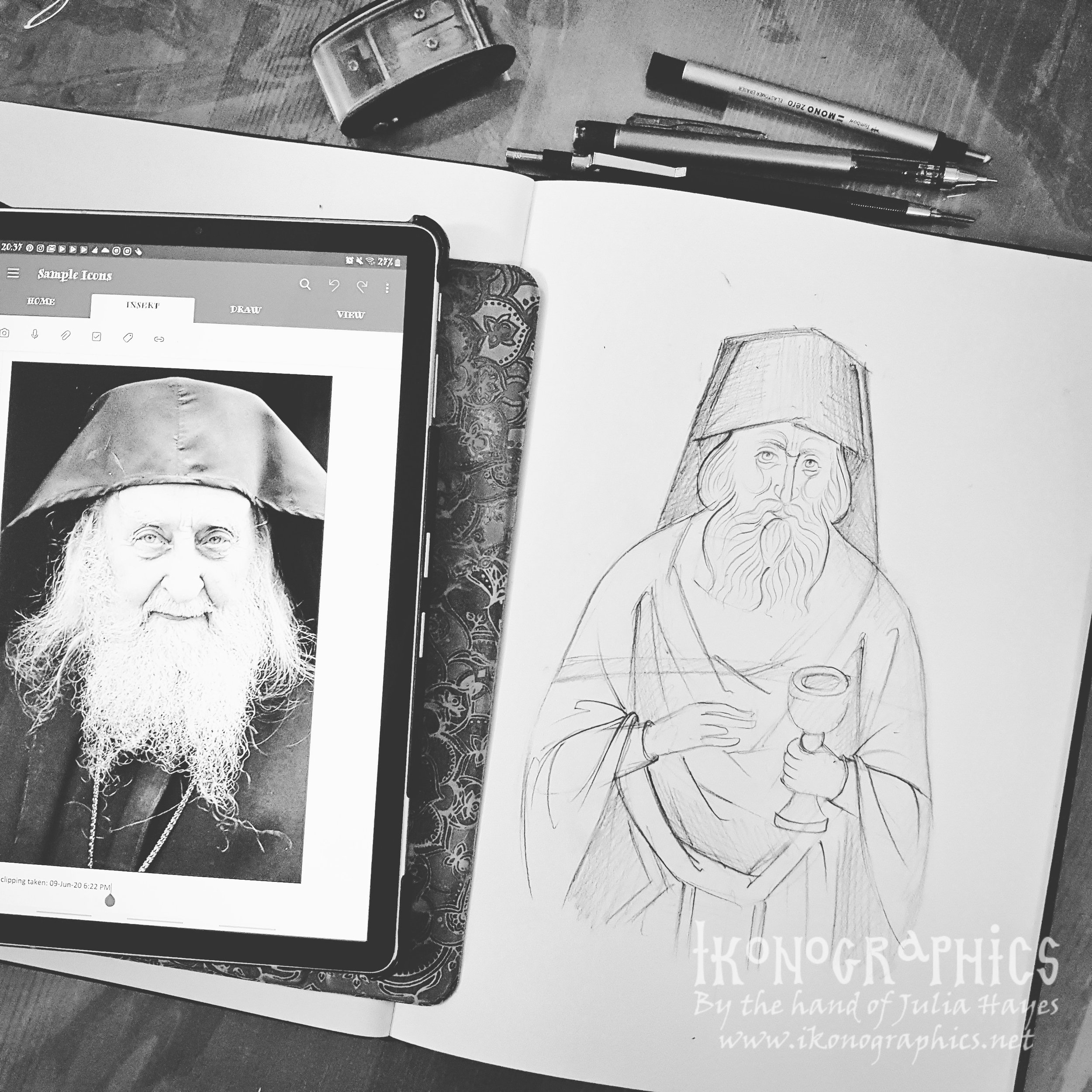
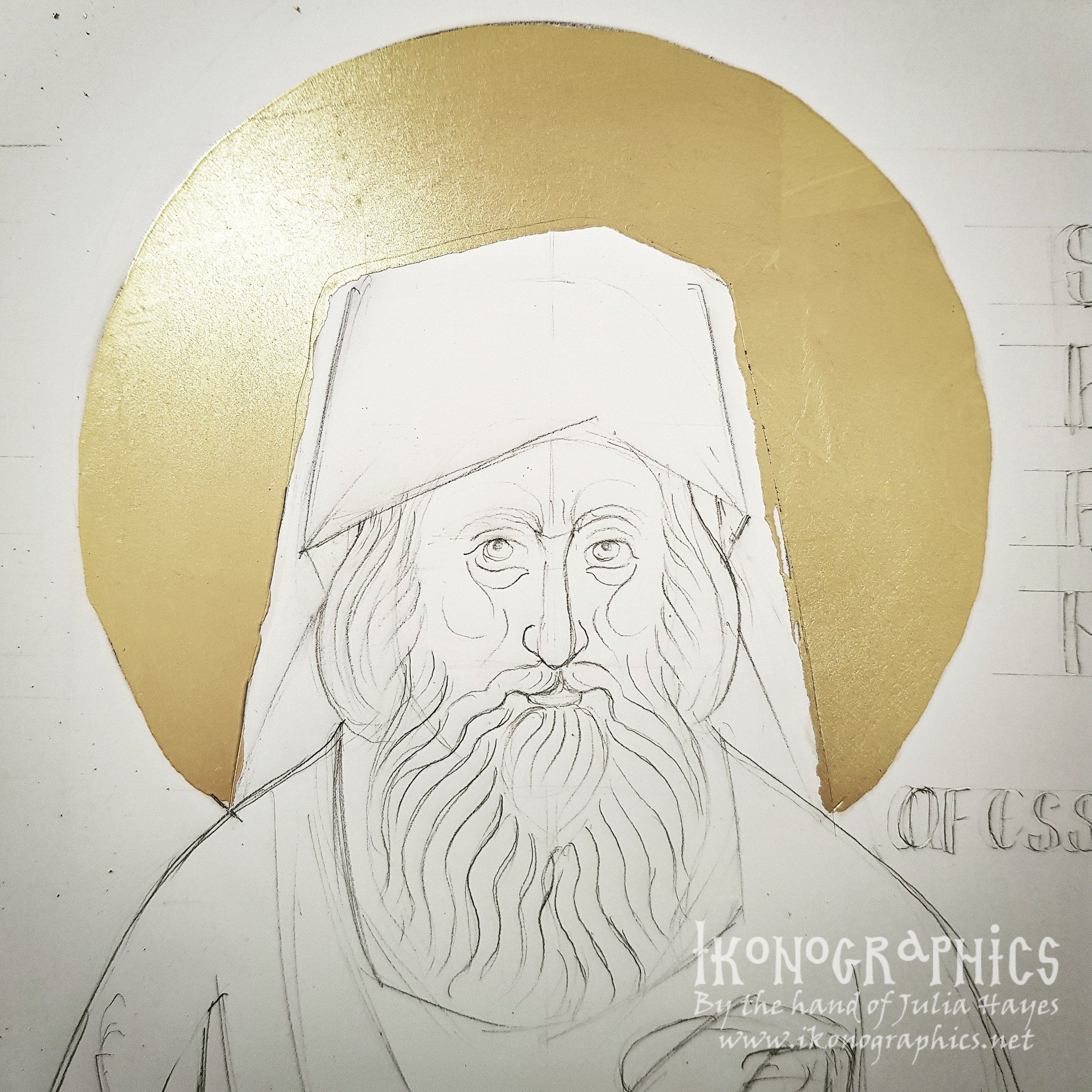
Preliminary Studies
One of the difficulties iconographers face today is painting contemporary saints precisely because we have photographs of them and everyone knows what they look like down to the last wrinkle. So we have to deal with the expectation of the faithful that the icon will look exactly like the Saint as they know him, like a portrait. So many iconographers will paint a naturalistic looking face on a byzantine style body which ends up looking like a bad Photoshop mashup. On the other hand if we paint the Saint in the byzantine manner we are often told it doesn't look exactly like the Saint!
So how should we portray contemporary saints? Should they be painted as naturalistic portraits so that they will look exactly as people have come to know them or in the traditional byzantine manner? The real question however is which manner fulfills the function of the icon?
Let us start by defining what the icon is. According to the Church Fathers the icon is the physical form of a person, be that of Christ or the saints. In order for the depiction of a person to be an icon it must bear their form and their name.
" Therefore it is in this form, seen by men, that the Holy Church of God depicts Christ… what the icon shares with the prototype is only the name, not what defines the prototype." (Acts of the 7th Ecumenical Council)
So the icon is one thing and the manner or style of depicting the icon is another. In Greek the distinction can be made between the icon as the form of the person (eikon) and the painted rendering of that form (eikonisma). The traditional forms of Christ and the saints are passed down by the church and belong to the Church, the artistic manner in which those forms are rendered belong to the painter: " Only the art is of the painter, whereas the disposition is certainly of the Holy Fathers"(Acts of the 7th Ecumenical Council)
The Church fathers never defined the manner or style that this depiction should be in. So technically a naturalistic depiction that bears the person's name is an icon. But can it fulfill the function of the icon and what exactly is that function?
The icon is NOT a "window to heaven". That is a modern understanding of the icon that originated in the west and bears no relation to the teachings of the Church fathers; St John of Damascus. St Theodore the Studite, and others. The purpose of the icon not to lift us up out of reality into another world, but to make Christ and the saints present in the same time and space as the viewer and bring them into a relationship with us.
Iconography is an expression of the body of the Church and not an expression of personal spirituality or a means of meditation. It is first and foremost liturgical art. In the Divine Liturgy we do not leave reality and enter into or ascend to another world, God descends to us; the Holy Spirit comes down upon the Holy Gifts. The whole architecture of the church with the Pantokrator in the dome emphasises that "God is with us". He is present here and now. The "Kingdom of God is at hand". In the Divine Liturgy past, present and future are united, as events of the past and the future are made present. This is why the hymns speak of past events as happening "today" and we remember the second coming of the Lord. Everything becomes "now"; everything becomes present, and It is this presence in the same time and space as the viewer that the icon reveals to us, not by opening up a so-called "window to heaven" beyond the surface of the painting, but by projecting the persons and events depicted off the painting surface and into the same time and space as the viewer with the aim of bringing them into communion. The icon makes visual what we experience in the Divine Liturgy. The saints depicted on the wall are not in heaven that we look at or are "lifted up to" through a window, they are alive here present with us in the here and now.
The byzantine manner of painting was developed because of its ability to do this through the use of line, rhythm, colour and movement. It is able to project the figures off the painting surface and into the same time and space as the viewer. In order to do this the forms are simplified. St Photius the Great tells us that the icon must be rendered in a manner befitting holiness, with a sense of solemnity. The image is purified of elements that are secondary or of "human curiosity" -eye colour, every single wrinkle, scars etc; things that have no spiritual or sotiriological reason. The abstract simplification of forms helps create the sense of calm and solemnity. The rhythmic use of line and the bright luminosity of the colours in byzantine iconography creates a sense of harmony and tranquility and also projects the forms towards the viewer.
The figures are depicted in' a dynamic frontal pose as this pose is able to project the figure off the painting surface. The head moves slightly in one direction and the eyes in the opposite direction. That way no matter where the viewer is standing in relation to the icon the person depicted in the icon is looking at them and they are brought Into a relationship. There is a sense of both movement and stillness in the icon and it is this that creates the sense of presence.
So this is what we as iconographers need to do when painting contemporary saints and it is no easy task. We need to take their familiar form and purify it of unnecessary elements. We need to give the form the rhythm and movement that will project it off the surface and into Communion with the viewer. The biggest difficulty we face is the lack of understanding not only on the part of the faithful, but many iconographers that creating the sense of rhythm and movement that will bring the saint into communion with the viewer is more important that the exact photographic likeness of the saint.

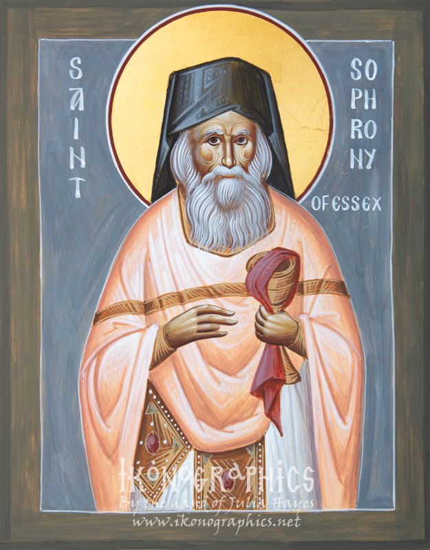
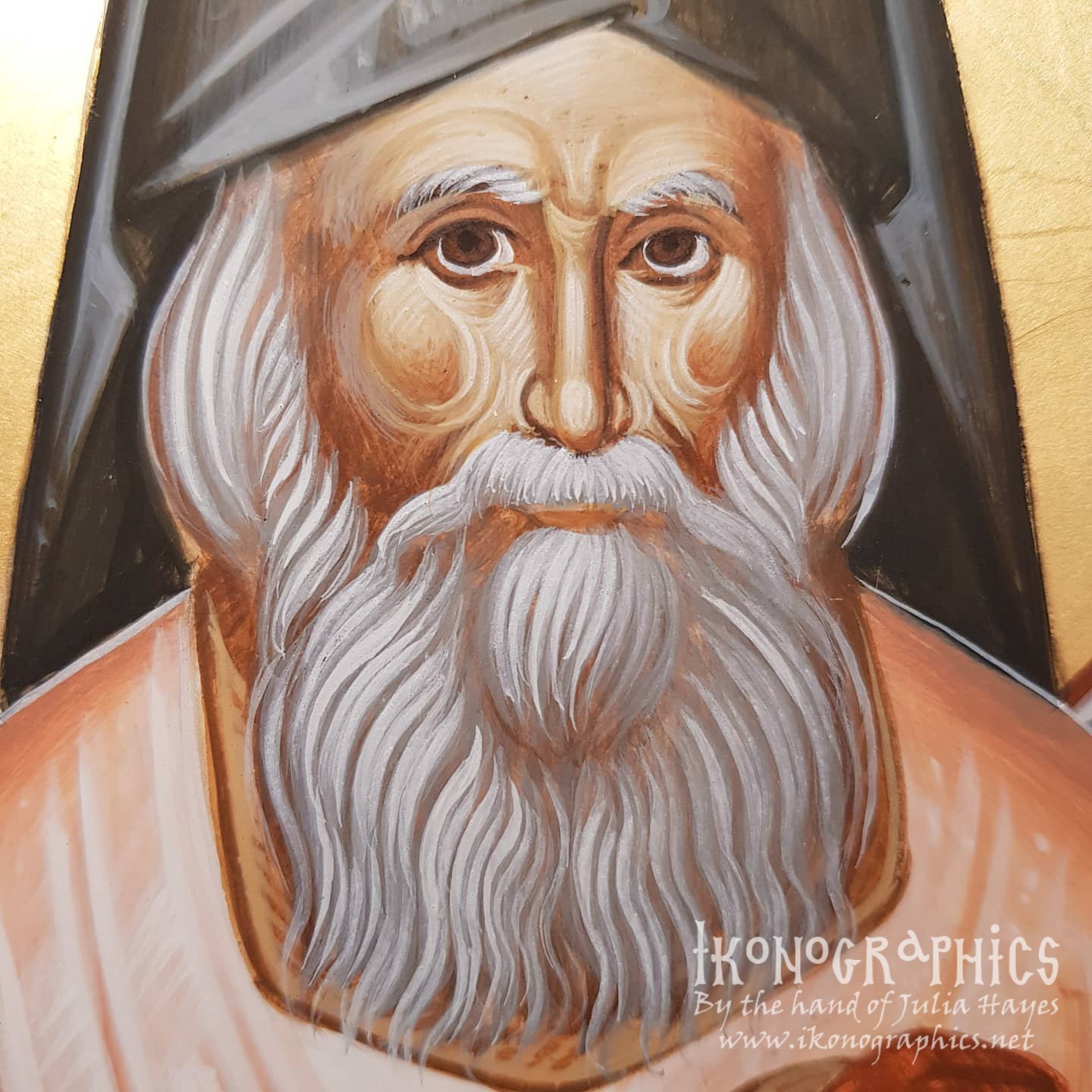
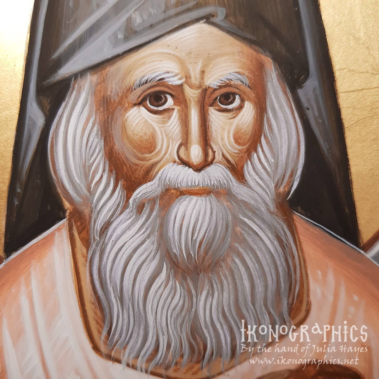
St Sophrony of Essex
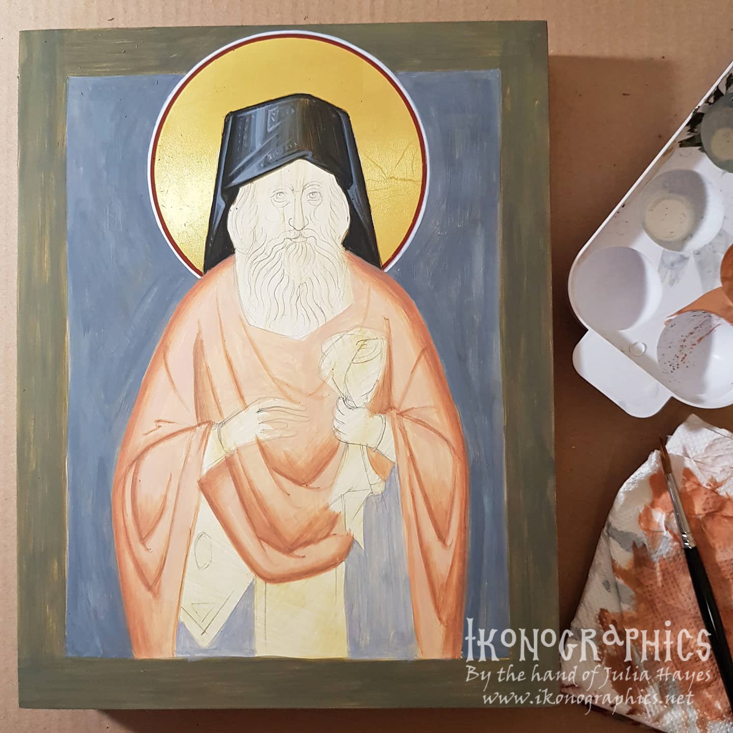
So in order to paint St Sophrony I studied several photos of him to find the natural rhythm in his features in order to translate them into byzantine rhythm. Fortunately his features lend themselves very easily to this. So I made a few preliminary sketches of his face and the basic layout of the icon. This is a small icon which makes maintaining the likeness of the features even more difficult.

Gilding the Halo
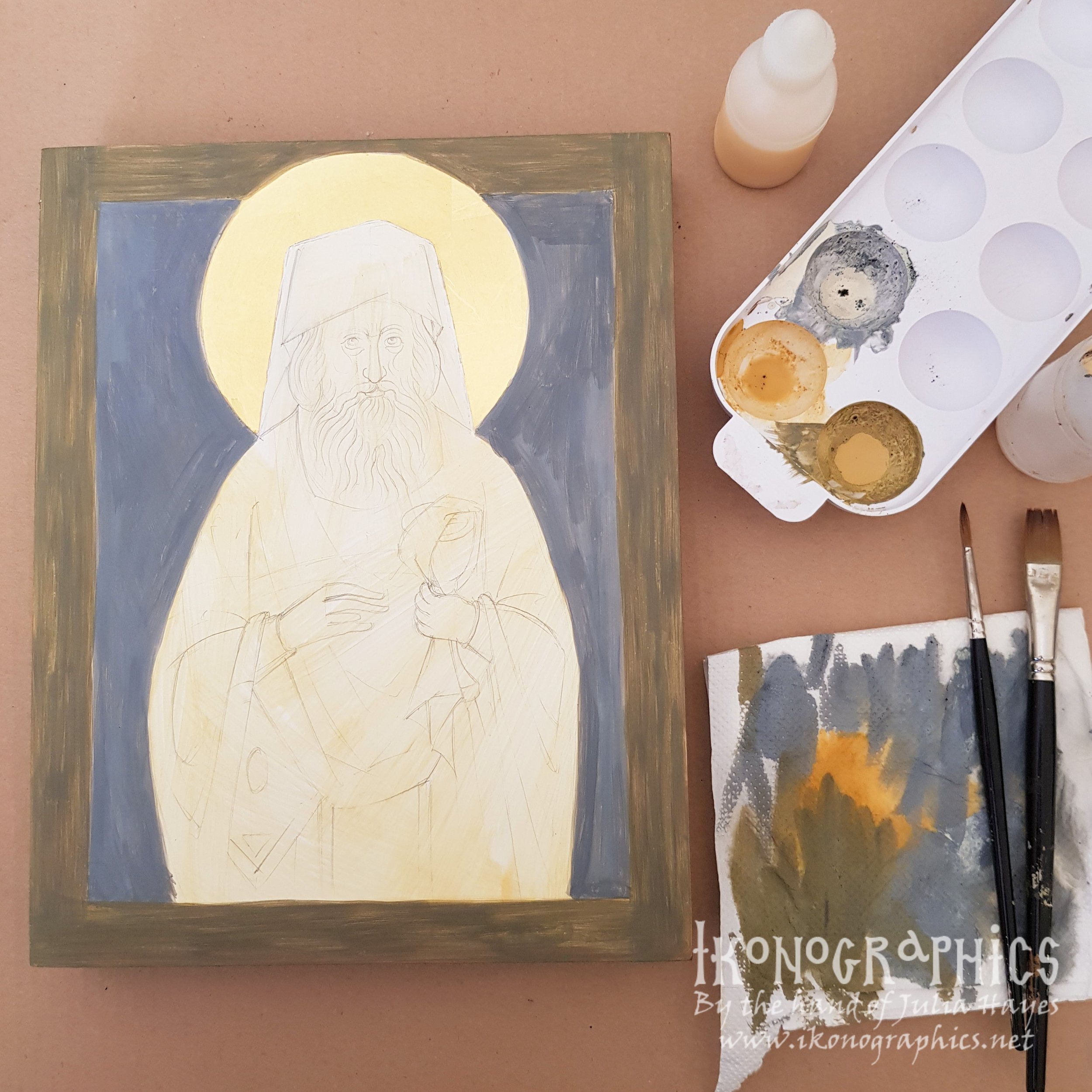
I decided to go with fairly dark blue background (made with black and white) as I wanted his figure to appear radiant. Colour in byzantine iconography works on the contrast between warm and cool and dark and light colours. So the cool dark background will contrast with his light warm phelonion. The olive border (black, oche, white) is a warmer tone compared to the blue.
The Kalimavki
Black garments are the most difficult to paint and not have them look dead and lifeless. I start of with a warm toned dark proplasmos of black and ochre and make sure that the colour is semi-tranparent and not opaque as the white shining though will keep the colour lively.

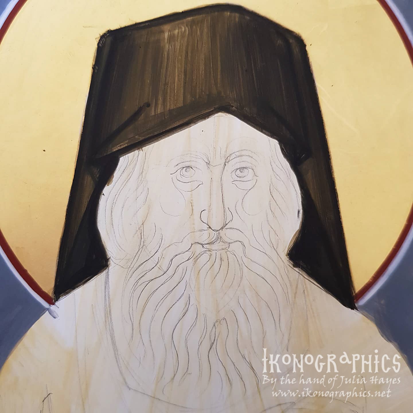
I build up the grapsimata and dark areas with the addition of black.

I then add white which created a cooler toned colour that in contrast to the warm toned proplasmos will make even the black garments look lively and not flat and lifeless.

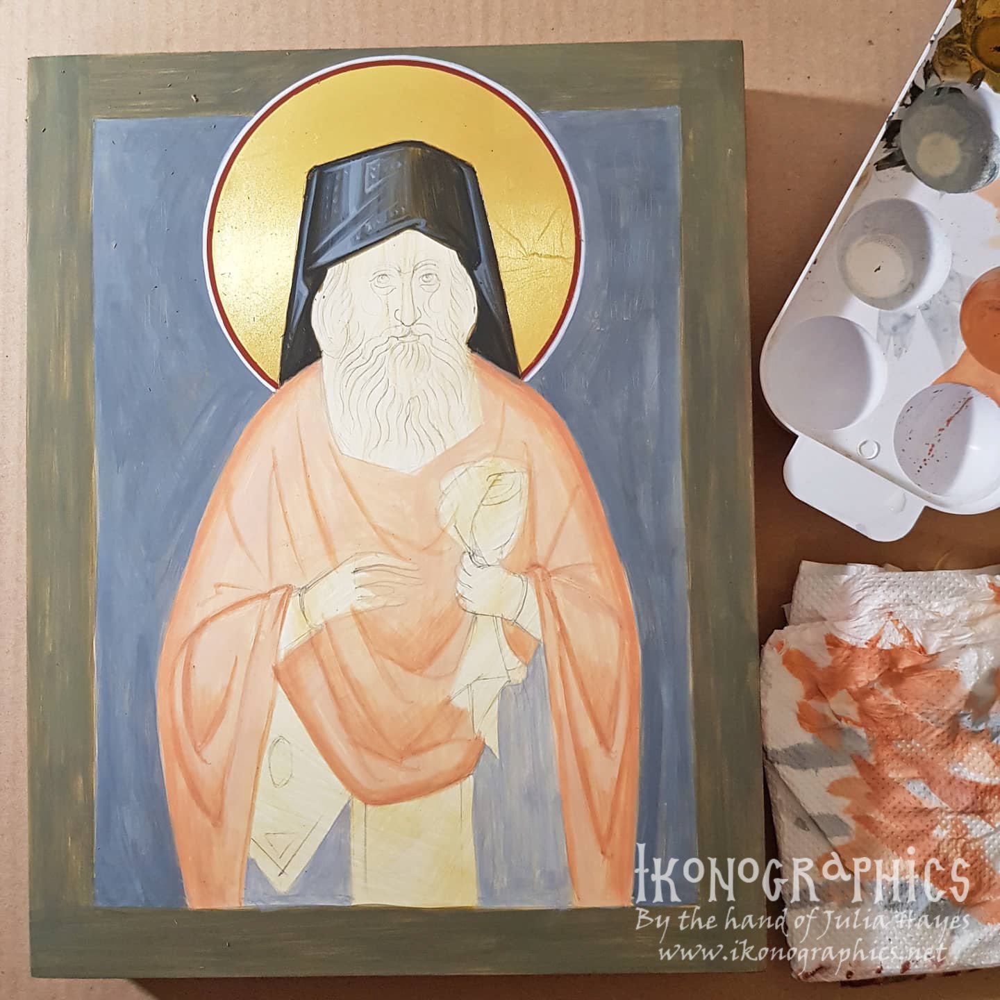
Phelonion and Sticharion
Although the phelonion and sticharion are "white" in byzantine iconography everything is colour and even white garments will start from a colour base. The phelonion is a very light peachy colour made from white, yellow ochre and red ercolano to contrast with the cool background, and the sticharion is a very light cool blue made with black and white to contrast with the warm phelonion.

I build up the grapsimata with the addition of yellow ochre and red ercolano and a touch of black in the darker areas.
The lighter layers are pure white which is cool in contrast to the warm peachy proplasmos and that contrast of warm and cool helps project the figure off the surface.

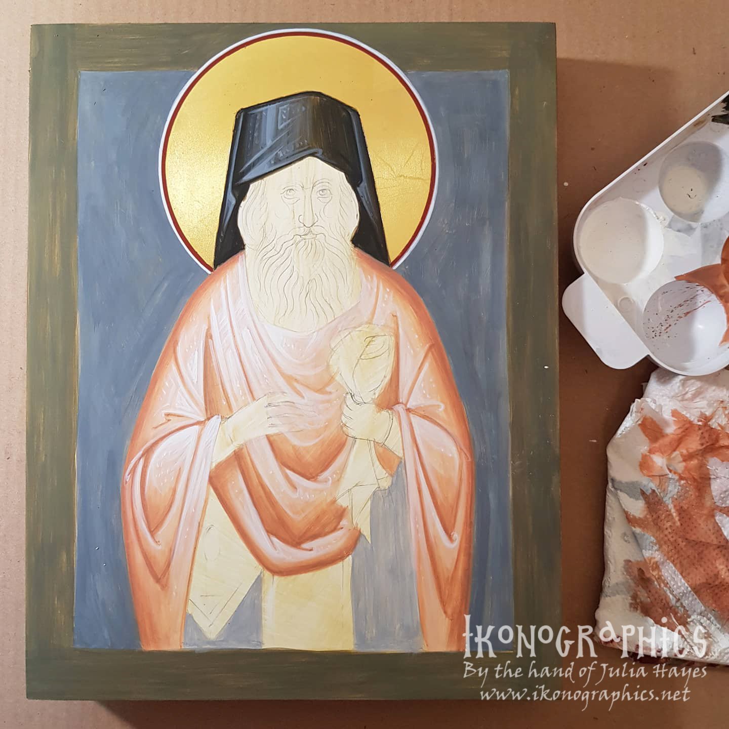
For the grapsimata on the sticharion, I added a touch of mars red making a purply mauve colour that will help project the blue/white towards the viewer. Byzantine iconography works the in the opposite way to naturalistic painting. Warm colours are used in the background (proplasmos, grapsimata) and cool colours on top of them to project the forms off the surface.

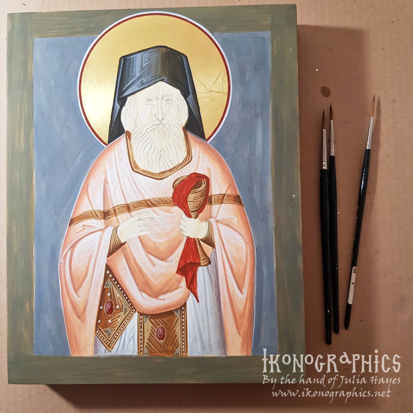
The proplasmos for the face and hands is made of ochre, red ercolano and black. I cover the hair with it as well as the warm undertone makes the beard more lively and it gives a more organic look. The beard is made with the proplasmos from the face plus white and black. I first cover the whole beard with a glaze and then start building up the forms. The grapsimata for the face are made with ercolano red and black and built up with more black.

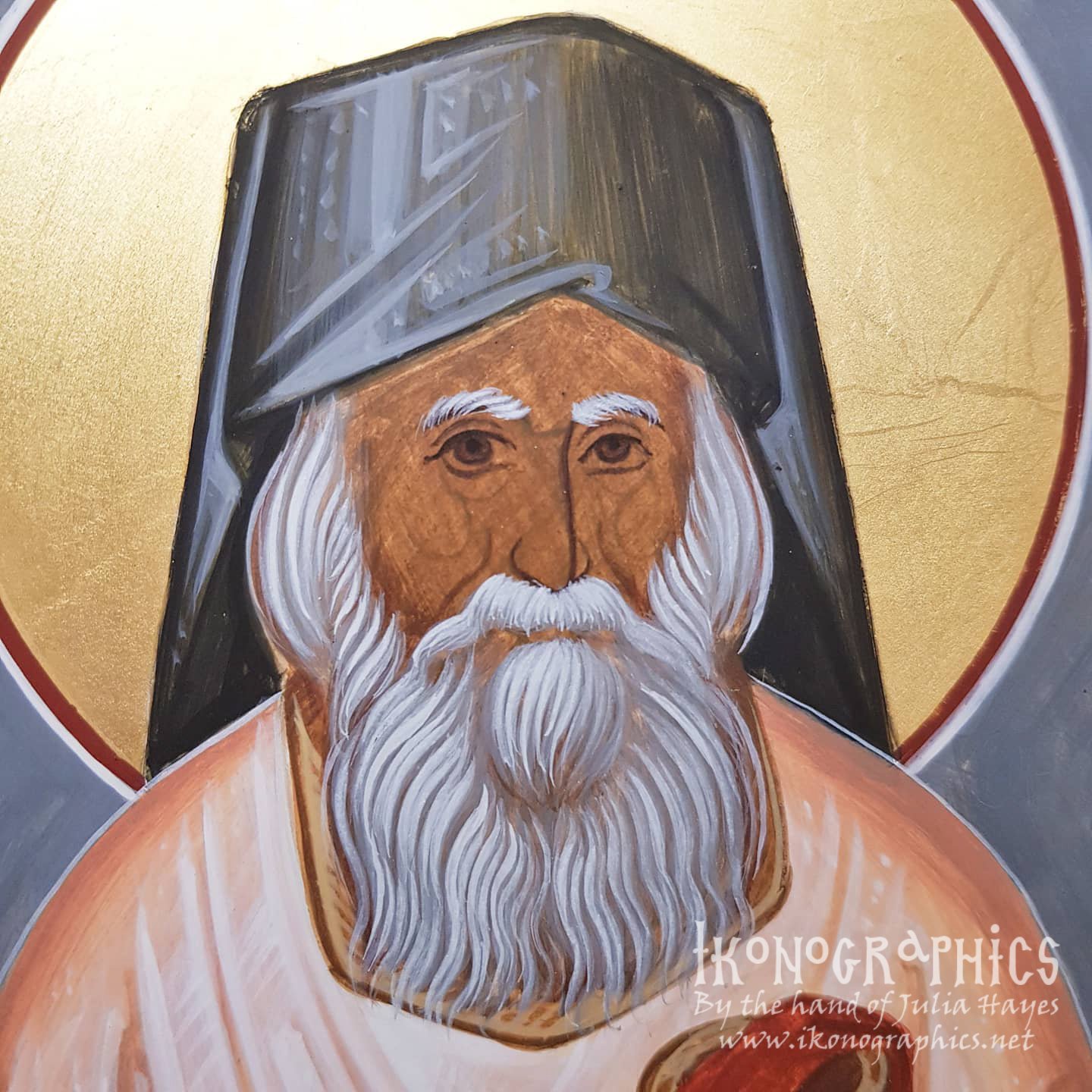
The flesh tone is ochre and white. Again I start with a semi-transparent layer and then build up the forms. In the subsequent layers more white is added.


This is where the face starts coming to life. On the wider side of the face, which is projected towards the viewer, I blend the skin tone into the proplasmos with a cool glaze make from the skin colour and a touch of black. Again this cool colour helps to project the figure towards the viewer. On the narrow side, which is further from the viewer I use a warm glaze made with red ercolano and ochre. This is also used on the lower lip, cheeks, the darker side of the nose and the bottom of the nose as well as the darker parts of the hands.
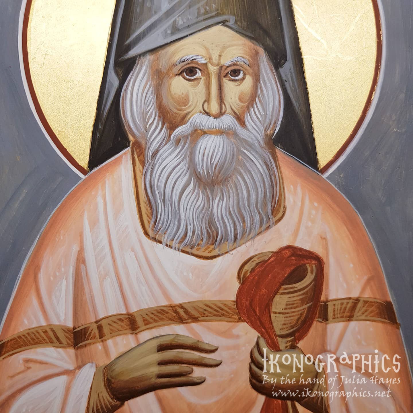
All the lines of the face, from the eyebrows to the cheeks to the psimithia and the hear create a rhythmic movement and harmony that create a sense of tranquility.


Are you interested in learning Byzantine Iconography? Learn more about my tutorials on Patreon and Udemy:
Would you like to commission a hand-painted icon?
If you enjoy my content consider buying me a cup of Kofi: https://ko-fi.com/ikonographics